Sony hyped up the 007 DualSense controller as an iconic nod to James Bond, but gamers quickly spotted a glaring design flaw. Jank design or legal nerf?
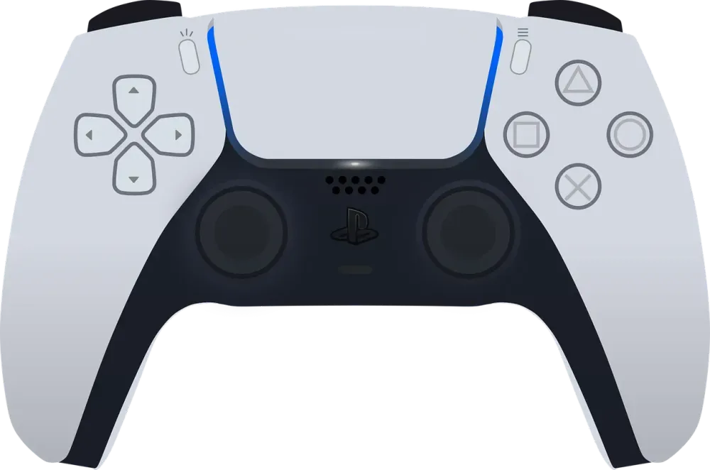


Sony just dropped their limited edition 007 DualSense controller. At a glance, the color scheme looks slick. But it didn't take long for the gaming community on Reddit to put on their detective hats and point out a massive design fail.
The OP on Reddit immediately got tilted by the design radiating from the touchpad. It's obviously trying to emulate the legendary James Bond intro—that iconic POV looking down a gun barrel.
But here's the major screw-up: real gun barrels (and the one in the movies) have rifling—those swirly grooves that stabilize the bullet. The DualSense? Just straight lines.
At first, OP tried to give them the benefit of the doubt, thinking maybe it was supposed to represent light rays. But nope. Sony's official blog post confirmed, not once but twice, that it's meant to be a "callback to the iconic barrel in the films" and "a nod to one of pop culture’s most recognizable visual signatures."
Bro, how can you call it "recognizable" when you didn't even get the basic geometry right?
The thread quickly racked up almost 9k upvotes, and the comments are pure gold. Here’s a breakdown of the meta:
1. The "Praise the Sun" Faction Many users pointed out that the straight lines make it look less like 007 and more like the Japanese Rising Sun flag. Dark Souls tryhards were quick to dub it the "Praise the Sun edition." Another guy joked that "barrel-inspired" actually meant a wooden barrel, calling it the "Cask-aged DualSense."
2. The IP Nightmare Theory Some big-brain commenters brought up a very realistic point: Licensing. Rumor has it that MGM owns the specific rights to the swirly gun barrel logo, while another entity handles the Bond IP. If Sony wanted the accurate swirly barrel, they probably would've had to pay extra royalty fees. So, the legal team likely stepped in and nerfed the design to avoid a lawsuit.
3. The Dev/Designer Reality Check Looking at it from a hardware design perspective, wrapping a 2D spiral graphic across the curved, 3D topology of the DualSense's touchpad area might have looked like absolute jank. Sometimes, complex patterns get incredibly messy in production. The designers might have tried it, realized it looked terrible, and hotfixed it to straight lines just to ship it on time.
Honestly, the controller's color palette is still pretty clean. But Sony’s marketing team hyping it up as an "iconic, recognizable signature" was a total self-own. You'd think a massive company wouldn't drop the ball this hard, but maybe their design team was lagging and needed a game booster designed to reduce game ping and stabilize gaming networks for players around the world just to keep their heads straight.
The takeaway for us devs and designers? Hardware limitations and IP lawyers are the true final bosses of the industry. Sometimes a weird UX or a "dumb" design choice isn't because the designer is a noob—it's because they were forced to compromise. But whatever you do, don't BS your community in the patch notes. Gamers notice everything, and they will drag you on Reddit.