Imagine cruising down the highway at 75 mph, trying to turn down the AC, and you end up swiping through three touchscreen menus while almost rear-ending a semi-truck. Congrats, you're not alone! After years of cramming giant iPads into dashboards, Mercedes-Benz is finally hitting Ctrl+Z and bringing back physical buttons.
The Great Touchscreen Rollback: What the hell happened?
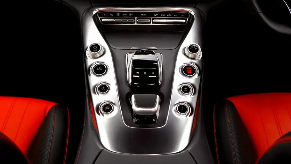
- For the last decade, automakers have been obsessed with "minimalist" interiors, moving every single control into massive touchscreens. Merc was leading the charge with their Hyperscreen madness.
- In theory, it looks incredibly clean and futuristic. In reality, the UX is an absolute nightmare when you're focusing on the road.
- Users complained. A lot. It turns out, finding a hidden sub-menu just to turn on the windshield wipers is a massive safety hazard.
- Now, Merc's design chief admitted they are shifting away from the "all-screen" approach. Future models will feature real, tactile buttons and rotary dials for core functions.
- They finally realized that cognitive load is a real thing, and forcing drivers to look at a screen for every tiny adjustment is just bad design architecture.
- To the Automotive UI/UX devs reading this: time to brew some coffee and prepare for some serious refactoring. Forget hosting your cloud-based control logic on a slick vps, you're going back to writing firmware for hardware switches.
Hacker News & Reddit react: The "I Told You So" Megathread
While the original thread is just warming up, anyone who has spent 5 minutes in dev communities knows exactly how the comment section is split:
- The Muscle Memory Gang: "Thank God. When I drive, I need tactile feedback. I want to feel the click, build muscle memory, and not stare at a glossy fingerprint magnet just to turn on my defroster."
- The Cynical Devs: "Let's be real. Touchscreens were never about 'the future.' It’s way cheaper to slap a cheap LCD in the center console than to manufacture, wire, and test 50 different physical buttons. It was a cost-cutting scheme masked as innovation. They just got caught."
- The Pragmatists: "Screens are great for GPS and Spotify. But critical controls—HVAC, volume, hazard lights—must remain physical. How did highly paid UX designers forget the golden rule of usability?"
The Coding4Food Verdict: Don't break what works
There’s a massive lesson here for all of us in the tech trench. Never sacrifice Usability on the altar of Aesthetics.
You can build an app with cutting-edge tech, smooth 60fps animations, and zero bugs. But if your user has to click three times instead of one to do their main task, your UI is trash. It’s that simple. Form must follow function. Sometimes, a dumb button is smarter than a smart screen.
What's your take, fellow code monkeys? Do you prefer tactile switches or glass panels? Drop a comment below and let's argue!
Source: